- HOME
- glass project
- Spirits
- Presobene
Presobene
Presobene revolutionizes the world of gin with an approach that blends creativity, research, and contemporary taste. A project in which bottle design becomes an essential ally in telling the story of a new way of drinking.
What does 'rewriting the alphabet of the palate' mean to you, and how does Presobene break the rules of traditional gin?
For us, it means questioning what is taken for granted in the world of gin.
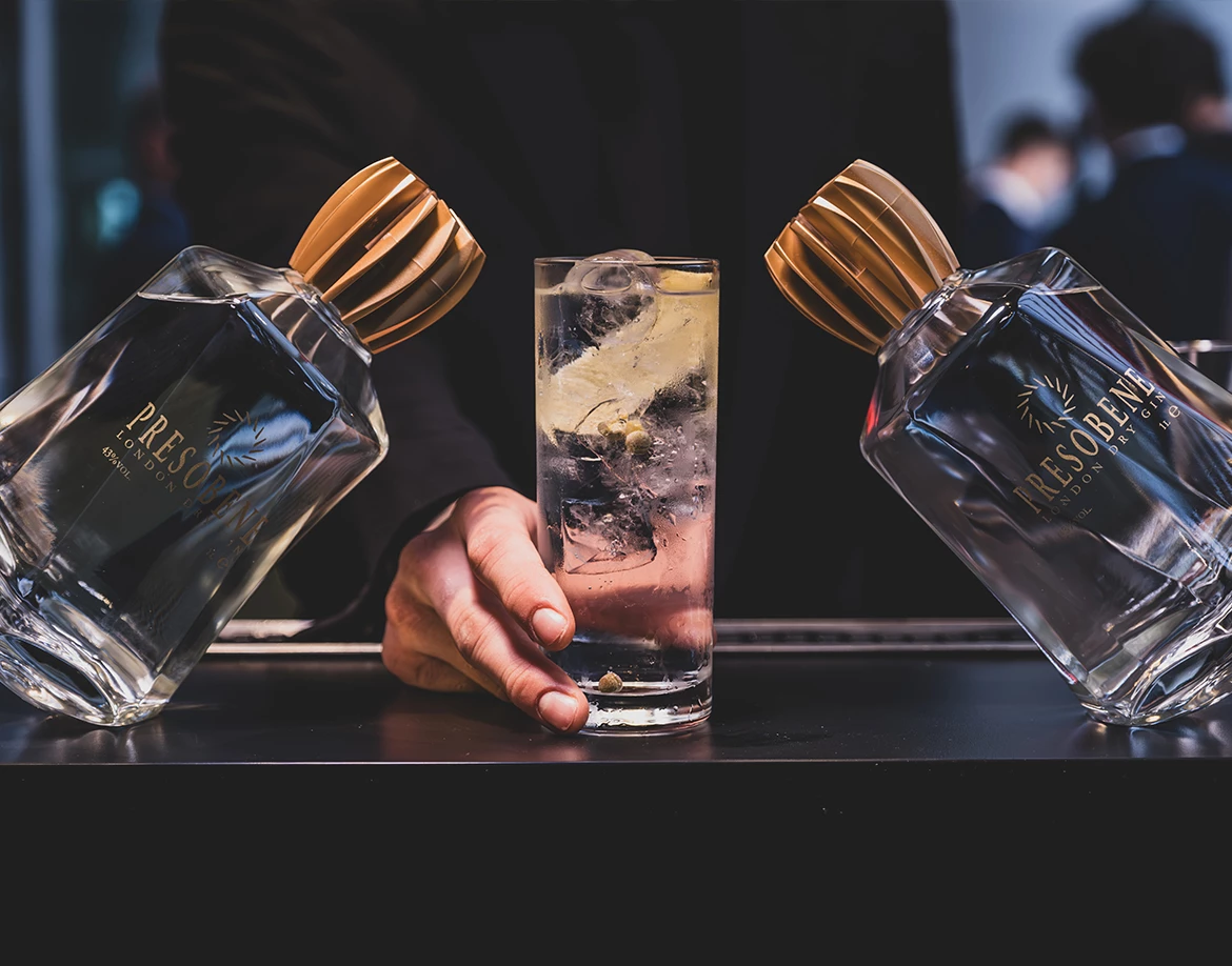
Presobene was born almost by chance: Alberto Presezzi wanted to create a gin and talked about it with chef Stefano Grandi of Il Santa restaurant in Milan. They started experimenting, distilling and tasting. The result was not the usual aromatic aperitif gin, but a gin that goes well with food, accompanying it rather than overpowering it. It is a gin for meals, made only with natural botanicals, without preservatives or added flavourings, with a natural savouriness given, among other things, by Salina capers. The sip does not conclude, but prolongs the pleasure, naturally suggesting another. This is where the rule is broken: Presobene is not a gin that comes before the meal. It is a gin that accompanies the meal. And it works afterwards too, because it is not tiresome. It lingers.
Presobene was born almost by chance: Alberto Presezzi wanted to create a gin and talked about it with chef Stefano Grandi of Il Santa restaurant in Milan. They started experimenting, distilling and tasting. The result was not the usual aromatic aperitif gin, but a gin that goes well with food, accompanying it rather than overpowering it. It is a gin for meals, made only with natural botanicals, without preservatives or added flavourings, with a natural savouriness given, among other things, by Salina capers. The sip does not conclude, but prolongs the pleasure, naturally suggesting another. This is where the rule is broken: Presobene is not a gin that comes before the meal. It is a gin that accompanies the meal. And it works afterwards too, because it is not tiresome. It lingers.

What inspirations guided the creativity of your bottle?
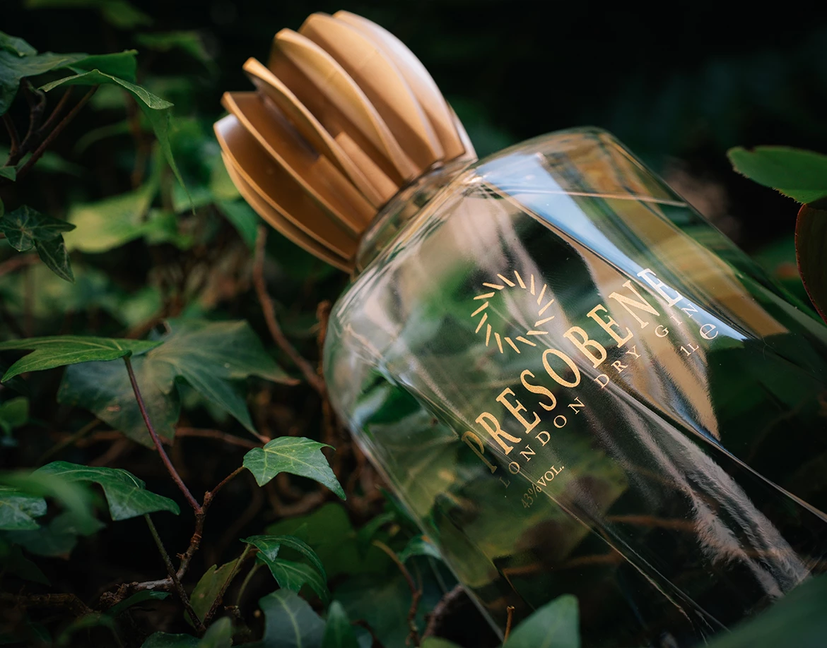
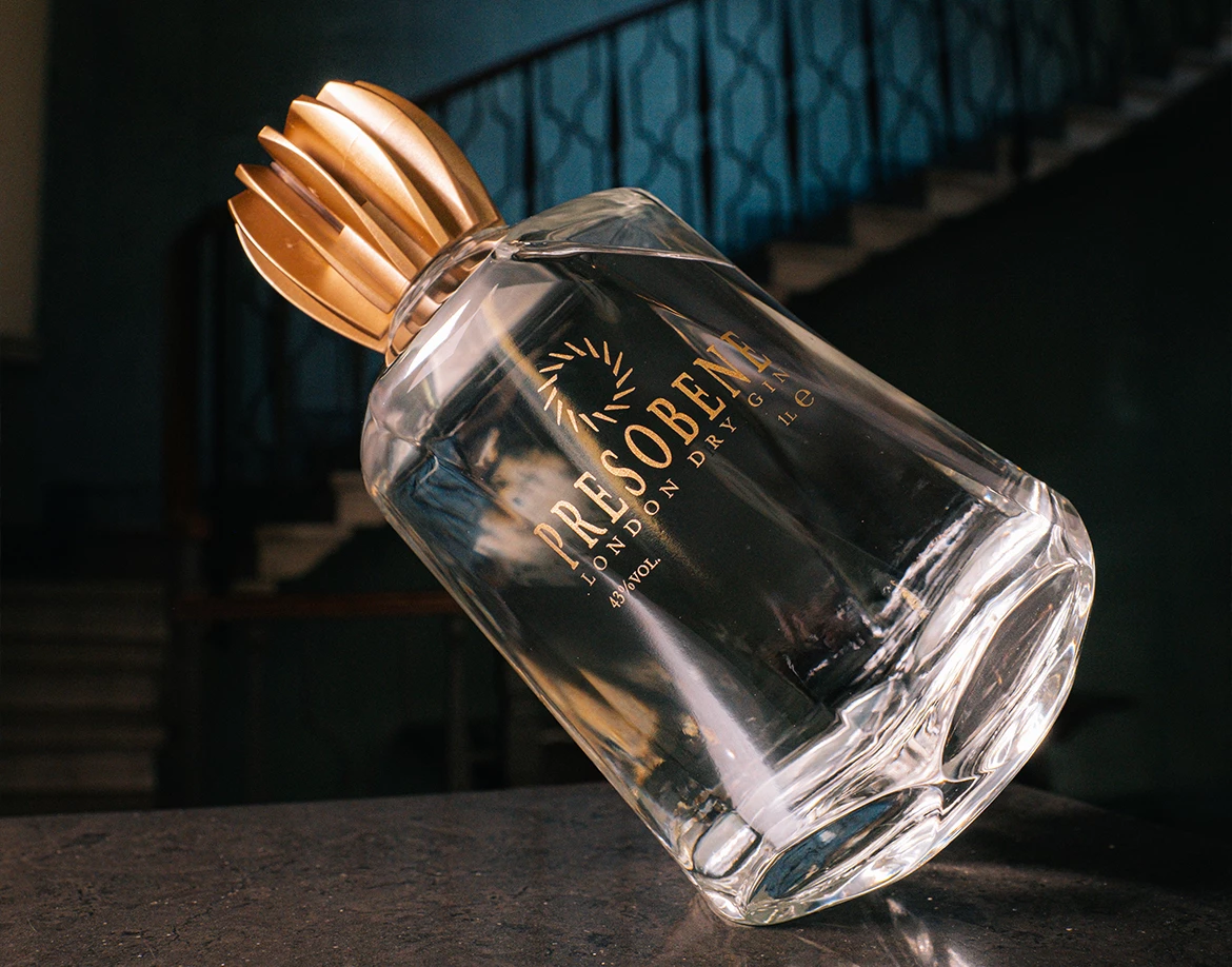
The bottle was born from the intuitions of architect Ivo Redaelli who, without considering production as a limitation, leaves room for creativity. The result is a structure that seems more sculpted than designed: multifaceted, balanced, almost suspended. The cap, a stylised turbine, is a tribute to the metalworking origins of Alberto's company, a reference to what generates movement.
How has the packaging supported the product narrative and your brand identity?
The decision not to use labels, but to decorate the glass directly, is not aesthetic, it is about identity. If you say that your gin is born of purity, intention and precision, you cannot then hide it behind excessive graphics. The bottle, when it is on the shelves of a bar or on a table, speaks for itself. It has no captions, no explanations alongside it. It is through its weight, its light and its presence that it communicates its nature. It is a statement: what you see is exactly what you drink.

