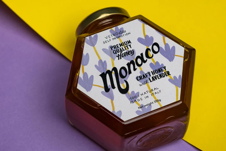
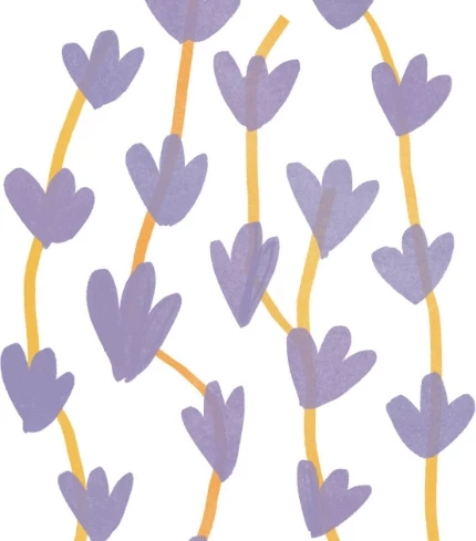
In our work we constantly try to intercept new trends, transform and apply them to the world of glass. Creating content that inspires across sectors, searching for and recreating a red thread: this is what distinguishes and identifies us. Our interest in illustration stems from our understanding of packaging as an art form, a way of enhancing content beyond the known and elevating it even in the most competitive scenarios.
YOONIK
For this capsule we decided to collaborate with Yoonik: a talent and project management agency dedicated to the world of illustration; their pay-off is “people, illustrations, ideas”. Their vision is really different. We relied on the traits of the artists represented to communicate. In a unique, original, unforgettable way.
CONCEPT
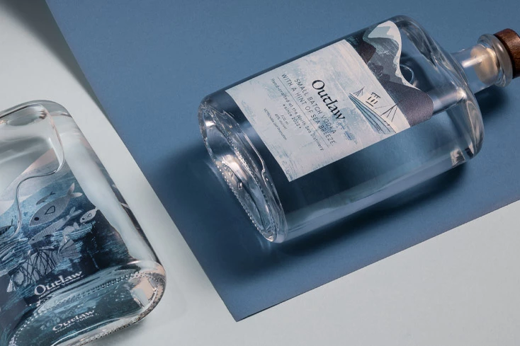
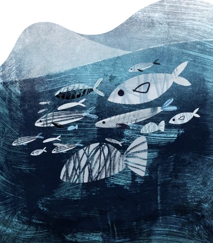
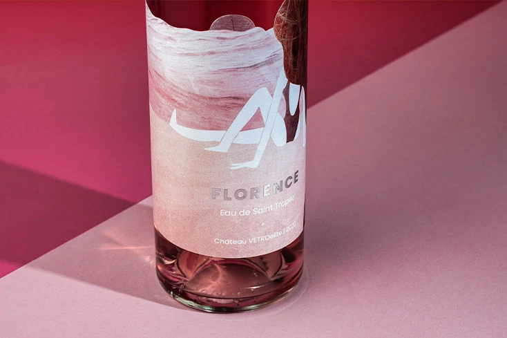
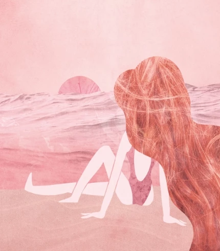
We worked on three of our iconic containers: a bottle from the world of spirits, one from the world of wine, and a jar for honey. Precisely because we wanted to create an unexpected dialogue between product and observer, we left the illustrators free to explore and create, in their own way, an artwork that would convey content and container. We asked them to tell their story, with color, stroke, details. We wanted the bottles to tell a story, without the need for words.
In collaboration with

PACKAGING AND ILLUSTRATION
What we like about illustration is that it is immediate, unambiguous, effective. Its high narrative and evocative capacities are able to strike and amaze immediately, arousing strong emotions in the observer. Sensations that are imprinted in the memory more than a thousand words, that remain in time. Applying this type of art to packaging means taking illustration to a higher level; the illustrated stroke becomes the engine and vehicle for evolving, differentiating, and competing in today's market. A crowded, hyper-competitive, international market, where the eye wants to be captured, with wonder. This art defines and characterises the graphic appearance of the packaging, giving strong personality to the product and strengthening brand awareness at the same time. Here, then, it becomes an excellent tool for defining and strengthening the positioning of the product, distinguishing it from the competition and increasing its attractiveness.
What we like about illustration is that it is immediate, unambiguous, effective. Its high narrative and evocative capacities are able to strike and amaze immediately, arousing strong emotions in the observer. Sensations that are imprinted in the memory more than a thousand words, that remain in time. Applying this type of art to packaging means taking illustration to a higher level; the illustrated stroke becomes the engine and vehicle for evolving, differentiating, and competing in today's market. A crowded, hyper-competitive, international market, where the eye wants to be captured, with wonder. This art defines and characterises the graphic appearance of the packaging, giving strong personality to the product and strengthening brand awareness at the same time. Here, then, it becomes an excellent tool for defining and strengthening the positioning of the product, distinguishing it from the competition and increasing its attractiveness.
